With the release of the 2011 census data I thought this was an ideal opportunity to learn a new skill to add to my armoury of data displaying abilities. So, I’ve made some gifs of the population data from 1911 – 2011 which, I hope, help illustrate the changing pattern of the population in England and Wales. I think they’re ok, but I’m sure I’ll get better.
Census data crunched by BBC.
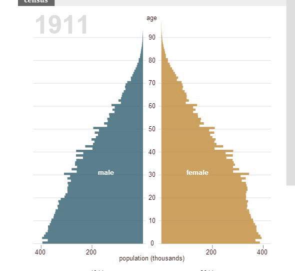
So as a control I thought I’d begin with what the population age ranges looked like in 1911. As you can see the line is pretty smooth indicating that the previous 90 years had no sharp population events which, as you’ll soon see, is rather different from the next 90 years.
One thing you’ll notice is that there are little “notches” at 30, 40, 50, 60 and, to a lesser extent 70. Why? Simply this is down to the way they asked the question. In 1911 they asked respondents how old they were and a significant number of people rounded their age to the nearest decade. These notches are not noticeable in later censuses because they asked for date of birth instead. It’s interesting how so many people thought their precise age wasn’t particularly important.
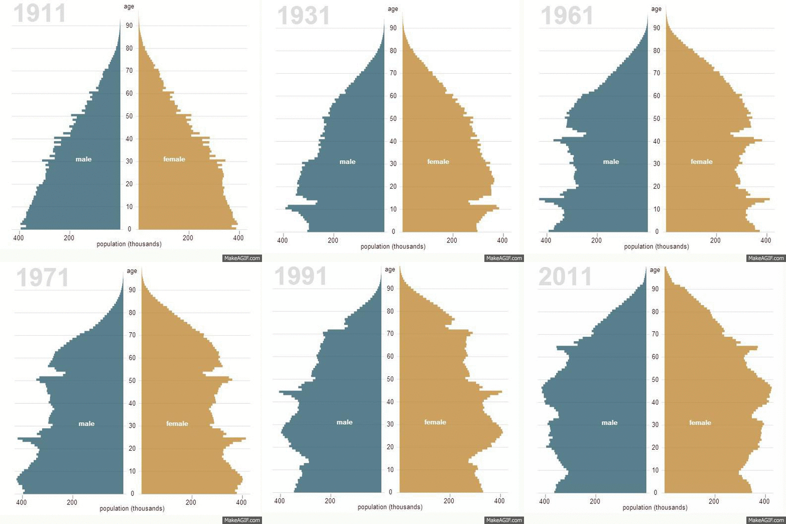
So here we see 100 years of population mapped into one animation. It’s instantly apparent that “things” happen in the twentieth century that have a deep impact on the people of this country.
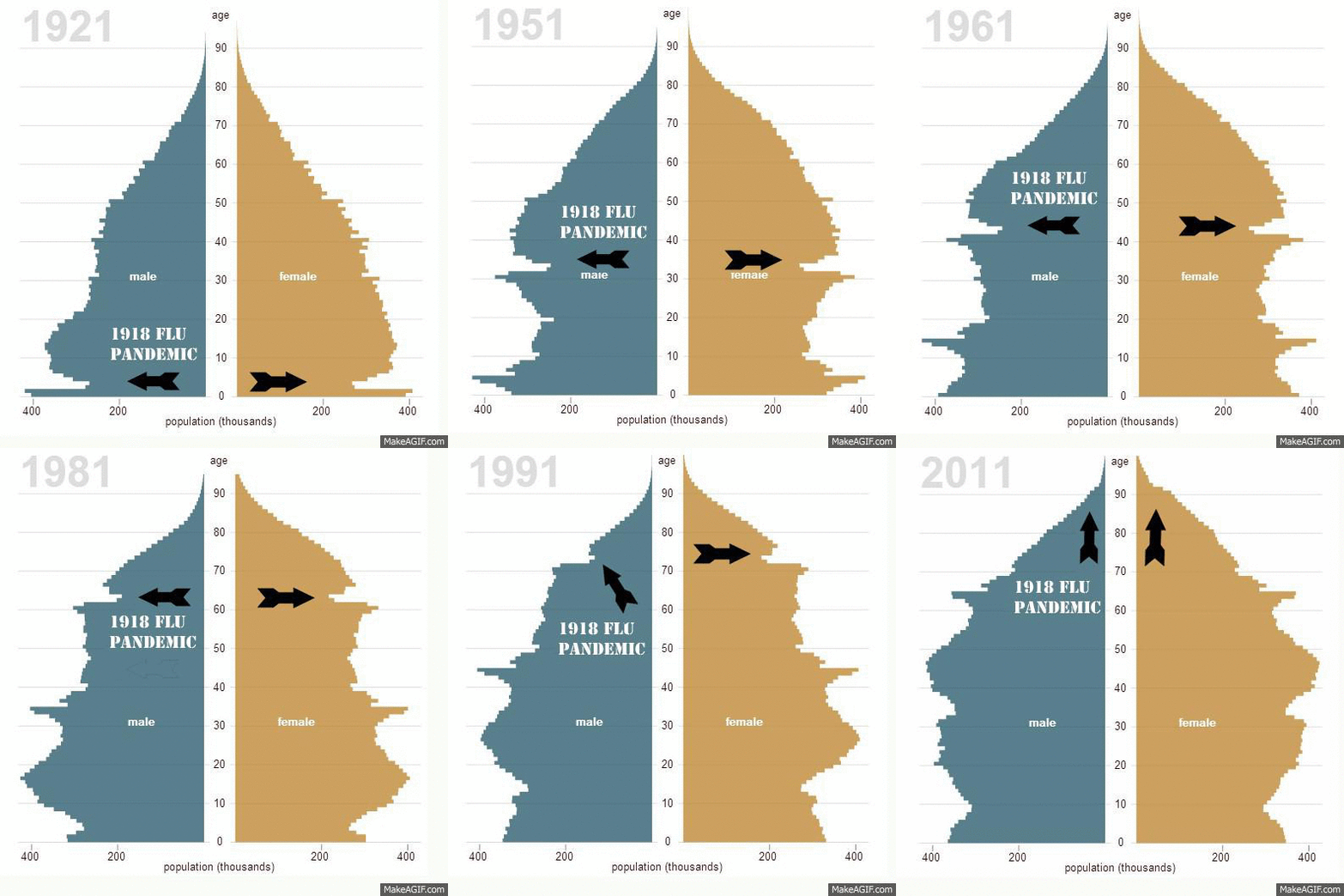
The first event I’d like to point out is the Spanish Flu epidemic in 1918 (to 1920) that, of course, killed up to 50 million people world wide and something like a quarter of a million in the UK. The epidemic particularly effected young people and unusually very few people over 65 died in the outbreak.
Not only were children disproportionately killed the birth rate itself was hammered as women and men between 20 and 40 died in large numbers. This event left its mark right across the century and it’s only today that its effect on the shape of population are no longer felt.
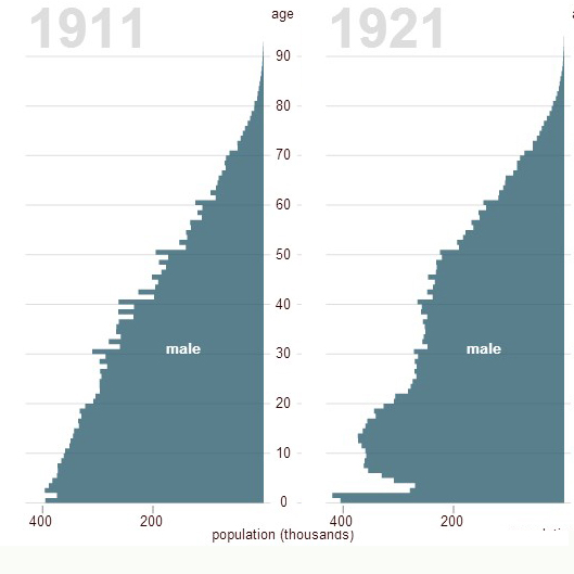
Here we can compare the shifts in population between 1911 and 1921 which can help us draw apart two mass mortality events.
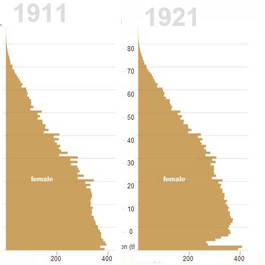
Both men and women are effected by the flu pandemic with a big dip in 2, 3 and 4 year olds in 2011 (and some effect in older young people). But we can also see when we look at male ages how the First World War (a coin termed in 1917 I believe) took a significant number of men from their late teens to around 40.
This tendency is less obvious as it stretches over the century, partly because it is less sharp than the massive drop in 1918 babies and partly because we simply don’t have a chart of what the figures would look like if the war had not happened. It’s extraordinary to see millions of tragedies displayed this way and the impact it had across the decades.
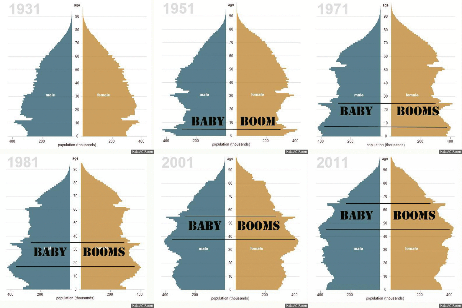
Coming to the post war years I thought I’d display the other big population events the baby booms of the end of war and post-war years. This is a happier set of figures in that we’re looking at more people rather than less. It’s a useful indicator to remind us that what feels like an inevitably aging population will, in fact, level out once the boom babies have lived their lives.

Lastly, I’ve zeroed in on the older part of the graph. It’s no surprise to see that we’re living longer than 100 years ago. It’s only in 1961 that we start to really see the effects of women living longer and 1991 that the effects of 1918’s flu calamity hove into view.
I’d also say it looks to me that we’re seeing a large number of people living into their 80’s but not a significantly sharp increase in the actual age the longest lived of us reach. In other words more of us are getting old but the oldest of us are only living a little older.
—
Anyway, I hope you’ve found this exercise in learning how to gif useful and interesting – I certainly think the figures really start to stand out when turned into images.
